Why did Facebook, LinkedIn and Twitter choose the color blue for their logo, while Pinterest chose red? Why does the color of most CTA buttons contrast with their backgrounds?
For a long time now it’s been known that color has a strong psychological effect on behavior and decision making. Therefore, it’s not surprising that many advertisers and marketers use color psychology (the discipline which studies colors’ effects on emotions, perceptions and reactions) in their work. Using certain colors can increase interaction with website visitors, create certain emotions towards the brand or trigger a certain reaction (social sharing, signing up, purchasing, etc.).
Marketing-wise, colors have a great influence: a study published in 2006 showed that 60-90 percent of our judgement of a product depend on its color. In this post by popular digital marketing blogger Neil Patel, he lists the following amazing facts about colors in marketing:
- 90% of our purchasing decisions are based on visual cues
- 85% of people say that a product’s color is their main reason for purchasing it
- 66% will not buy certain products if they’re not available in their desired color
This infographic from homestead further illustrates the importance of colors in marketing and advertising:

Naturally, colors play a central role in digital marketing, too: you should carefully consider the colors you’re using in designing your website, your paid ads, your mobile app, your CTA buttons, etc. This post will list 7 ways in which you can use color to enhance your digital marketing strategy. So before choosing the colors for your Facebook ad or the background of your website, we recommend you take the time to read these tips.
1. Consider common perceptions of colors…
Different colors tend to arouse different emotions – so when you’re designing a website, a logo, an ad, etc. – it’s important to consider the messages specific colors convey. In a 2003 survey conducted by American designer Joe Hallock , which included 232 people from 22 countries around the world, he asked participants to choose the color which they associated with the following words. Here are some of the results:
- Trust – most people (34%) chose blue, with white coming in second (21%) and green (11%) coming in third.
- Security – again, most people (28%) chose blue. Black (16%) and green (12%) followed.
- Speed – the majority of participants (76%) chose red.
- Cheap/inexpensive – orange came in first (26%), followed by yellow (22%) and brown (13%).
- High quality – the majority chose black (43%), and blue came in second (20%).
- High tech – opinions differed widely on this one: while black came in first (26%), blue and gray came in a very close second (23% each).
- Reliability/dependability – blue won the majority (43%), black followed (24%).
- Courage/bravery – most participants (29%) chose purple, but red was a close second (28%) and blue came in third (22%).
- Fear/terror – red was the winner for this one (41%), followed by black (28%).
- Fun – most chose orange (28%), and it was followed closely by yellow (26%), then purple (17%).
The following video shows how brands choose certain colors according to what these colors represent:
2. But don’t forget to take cultural differences into account
A certain color may have different meanings in different cultures – which is something you must consider when marketing to certain groups. Here are some examples:
- In the West, white symbolizes purity and is therefore a common color for wedding dresses; in China, though, it symbolizes mourning.
- In India, red is the color that symbolizes purity; but in the West it symbolizes passion and is also associated with certain holidays, like Christmas.
- In most Western countries, yellow symbolizes happiness; but specifically in Germany, it symbolizes envy. In Eastern cultures, it is a holy, royal color; but in Latin America, it is associated with death and mourning.
The following infographic from information is beautiful will help you discover what different colors mean in different cultures around the world:

3. Be authentic in your color choices
The two previous tips included some rules of thumb you must play close attention in your color choices; however, it is important to remember that you shouldn’t choose a color only because it conforms to certain stereotypes. Some companies think that choosing a certain color customers love will help them with sales – but this kind of thinking is wrong. Most studies on color psychology will tell you that it is more important to match the brand’s colors to its personality.
In an interview to Inc. magazine, Leslie Harrington, executive director of The Color Association and a color consultant, said that customers notice immediately how a color relates to a brand and whether this connection is authentic; a non-authentic connection drives them away.
4. For CTA buttons, use colors which contrast with the background
The call-to-action buttons in your website or landing page are hugely important, as they’re the central means for converting visitors into paying customers. Therefore, it is paramount that they stand out from the rest of the page.
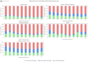
In 2011, Hubspot conducted an experiment which made many people think that a red CTA button converts more than a green CTA button. However, that’s not entirely accurate. The background of the page in that experiment included a lot of green, which made the green CTA button less conspicuous than the red one in that specific case. This shows us that the effect of the button’s color is also dependent on its background.
This phenomenon is explained by the isolation effect, also known as the Von Restorff effect, which accounts for our better memory of an item that differs significantly from similar items or from its background. A good example of this effect is a grocery list in which all items are written in blue except for one which is written in red. In all probability, that item will be the one we won’t forget to buy.
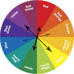
Therefore, in choosing a color for a CTA button, there are three main things to consider: first, that primary and secondary colors (red, orange, yellow and green) tend to to be the most converting; second, that the chosen color contrasts nicely with the background; and third, that using dark colors (purple, brown, dark blue or dark green) isn’t recommended.
This color wheel is a good way of seeing which colors contrast best with each other:
5. Don’t neglect the color white
While it may be tempting to go wild with the color palette on your website or social media page, it’s important not miss an often forgotten color: white. Officially, white is an achromatic color (a color without hue), composed of all the colors of the spectrum. Still, that doesn’t mean it has no significance in branding and design. In fact, it is dominant color in the most popular website in the world:
Another international brand using wide expanses of white is Chanel:

White conveys freedom, space and airiness – all positive associations. So it’s always important to consider it when choosing colors for your brand’s digital channels. Most well-designed websites today are making great use of white spaces.
6. Familiarize clients with your color palette
When choosing colors for different elements of the website (CTA buttons, links, menus), it is important to be consistent, not only for the sake of clarity and uniformity, but also to make your clients associate certain colors with certain actions. this way, when they want to perform a certain action, they’ll know which color to look for.
Look at this great example from Campaign Monitor, an email marketing platform. All buttons through which you can sign up to the website are green:

While the “Learn More” buttons are white and blue:

7. Don’t forget to test
Even if you put great thought into choosing colors for your website and use all the above tips, you won’t know for sure if these colors work for you until you test them. The color choosing process should therefore include A/B testing in which you test two versions of the website (with different color schemes) to see which one shows better results.
This video explains the importance of A/B testing:
Conclusion
Colors are more important to your digital marketing strategy than you may realize. Take the time to learn about the significance of colors in branding; play with changing the colors in your website or social pages and see how your clients react.
Do you have any examples of a clever use of color by brands? Share them with us in the comments section!